Fuze visual redesign
My role: visual design, user interface, information architecture
The Fuze Desktop and Web apps provide enterprise businesses with unified Calling, Meetings, Messaging, and Contact Center services.
The Challenge
We wanted to update Fuze Desktop’s visual design to help differentiate it from competitors, align better with the company’s branding strategy, and visually refresh and modernize its appearance to better appeal to today's enterprise end users.
While we had engineers working throughout nearly all areas of the product, I wanted to try to make any usability improvements that we could without increasing the scope too greatly.
Explore broadly, combine specifically
We started the redesign as a group. Every designer on the team explored ideas from simple changes to wild re-imaginings of the entire interface, information architecture, and application. As we explored individually, we came together to share our ideas and critique. After several iterations and reviews, our ideas started to converge. I was then tasked with taking all of these inputs and figuring out what would work best in the real world for our enterprise business user base across the array of personas we support. We also shared with our product marketing team to assess alignment with our corporate branding guidelines, and engineering to determine the feasibility and development effort required for various aspects of the proposed design.
Lighten up! (and modernize, brighten, and clarify)
Some main visual considerations included:
Lightening up, simplifying, and clarifying the interface to prioritize the content and interactions the user is having with their work colleagues, and provide a friendly, welcoming appearance.
Reduce the bubbly quality of the overall interface.
Modernizing the look and feel to incorporate current visual design trends like flat design and color gradients to provide an up-to-date and crisp look and feel. Enterprise users today all have smartphones and see the latest apps and design concepts within them on a regular basis. Long gone are the days of "good enough for business."
Look like Fuze. A previous iteration of the visual design left the app looking confusingly similar to one of our major competitors and used a color palette that was somewhat divergent from our corporate branding.
In addition to updating our visual presentation, I wanted to use the opportunity to improve a few functional “rough edges” that were in the areas of the screen engineers would already be updating.
Legacy product
Updated design
Making purple "work"
One of the biggest conceptual visual challenges we had was color. Specifically trying to make purple "work" in an enterprise business application. Purple is Fuze’s core brand color with all of the other colors in the Fuze logo as secondary, but purple isn’t generally thought of as a business color, and unlike many other colors, doesn’t really have any established meaning. The previous visual design seemed to have tried to solve this by making the main header bar the darkest purple you could still (sort of) tell was purple, presumably in an attempt to hide that it was purple at all. On many screens and for many users however, this ended up looking almost black, and made the appearance very dark and unwelcoming. Additionally, it was fairly similar to a very well known chat focused competitor. Purple had also been used heavily for headings, actions, labels, and titles. Even gray highlights had a purple cast to them making the appearance very monotone.
Working with our Worldwide Director of Product Marketing, we were able to come up with a range of purples that complimented the brand color but were lighter. We used this to apply a new subtle gradient to the app header bar and applied sparingly throughout the app as a highlight and in special cases where it was used for some common actions.
We also established a range of new grays that were less purple tinted, while still somewhat cool to compliment the purple, which we used for backgrounds, dividers, and headings and titles. For primary actions we moved from both purple and our existing teal color to a slightly more blue teal which is distinct from the rest of the ui and also aligns with user expectations of "blue" meaning "link."
Legacy chat screen
Updated chat design
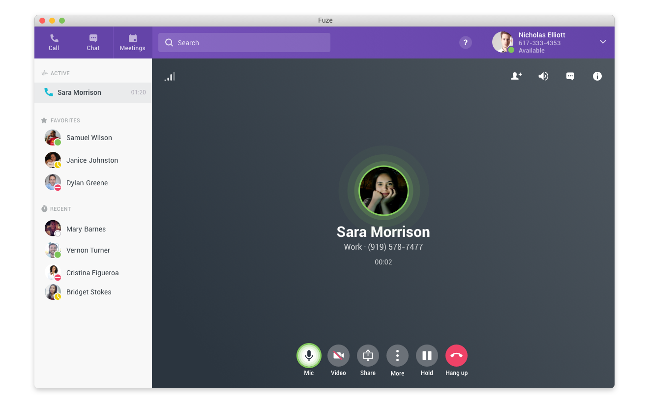
Legacy call screen
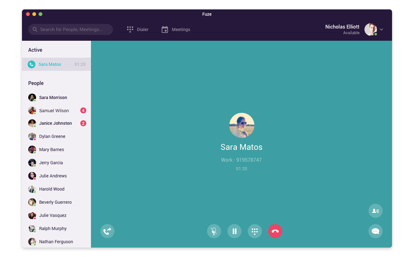
Updated call design
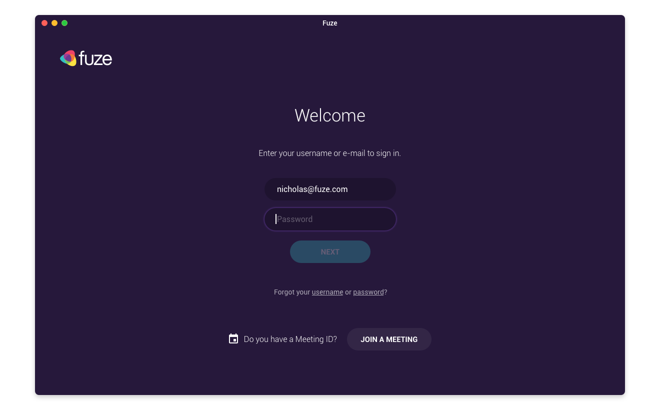
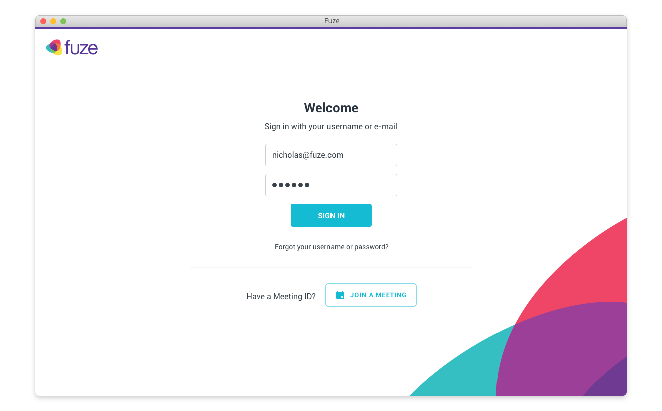
I switched our previously all dark purple sign in and loading screens to white and added a large watermark of part of the Fuze logo to the bottom right corner to impart the brand and introduce our friendly color palette.
Legacy loading screen
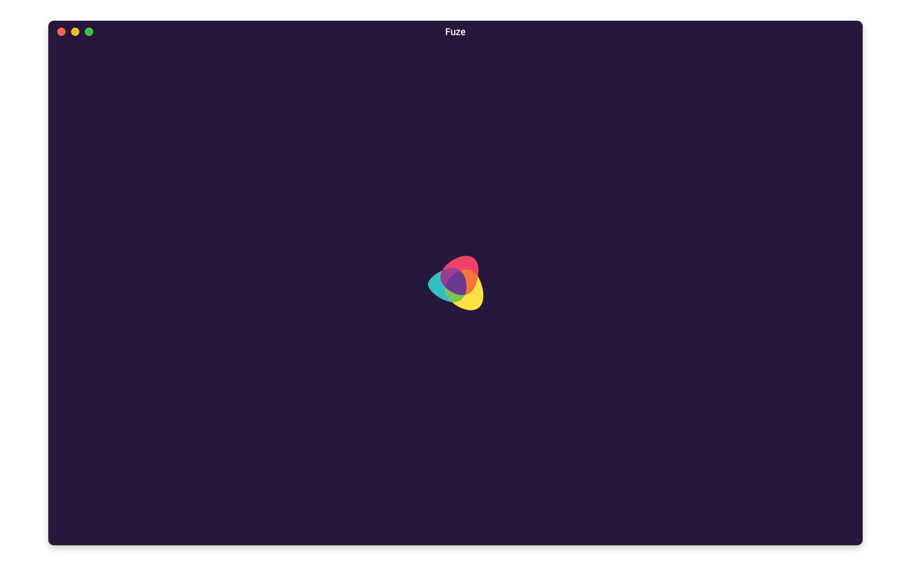
Updated loading design
Legacy sign in screen
Updated sign in design
To add some engagement and highlight special areas or items that need user attention, we created a series of color gradients using our brand colors and applied them strategically.
New color highlight
Calling attention where needed
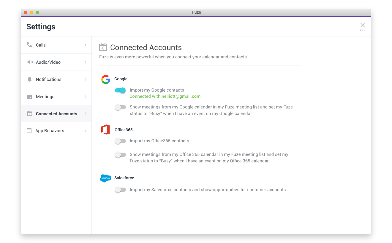
For the remaining screens it was largely a matter of organization, clarifying navigation vs content areas, and standardizing navigation elements.
Legacy search screen
Updated search design
Legacy settings screen
Updated settings design
Getting serious
Avatars, buttons, icons, inputs, and boxes were all very round, giving the Fuze an overly bubbly appearance that didn’t feel right for a tool targeted for enterprise business users. In some places, like the avatars and some primary action buttons, circles worked well so we didn’t want to get rid of them entirely. To provide some visual differentiation however, we reduced the border radius of rectangular buttons, boxes and inputs to 4 pixels, to balance round and friendly with straight and serious. We reduced the use of icons used as labels, using easier to parse text labels instead. Where it was appropriate, we removed icon buttons from circles and made them our teal primary action color.
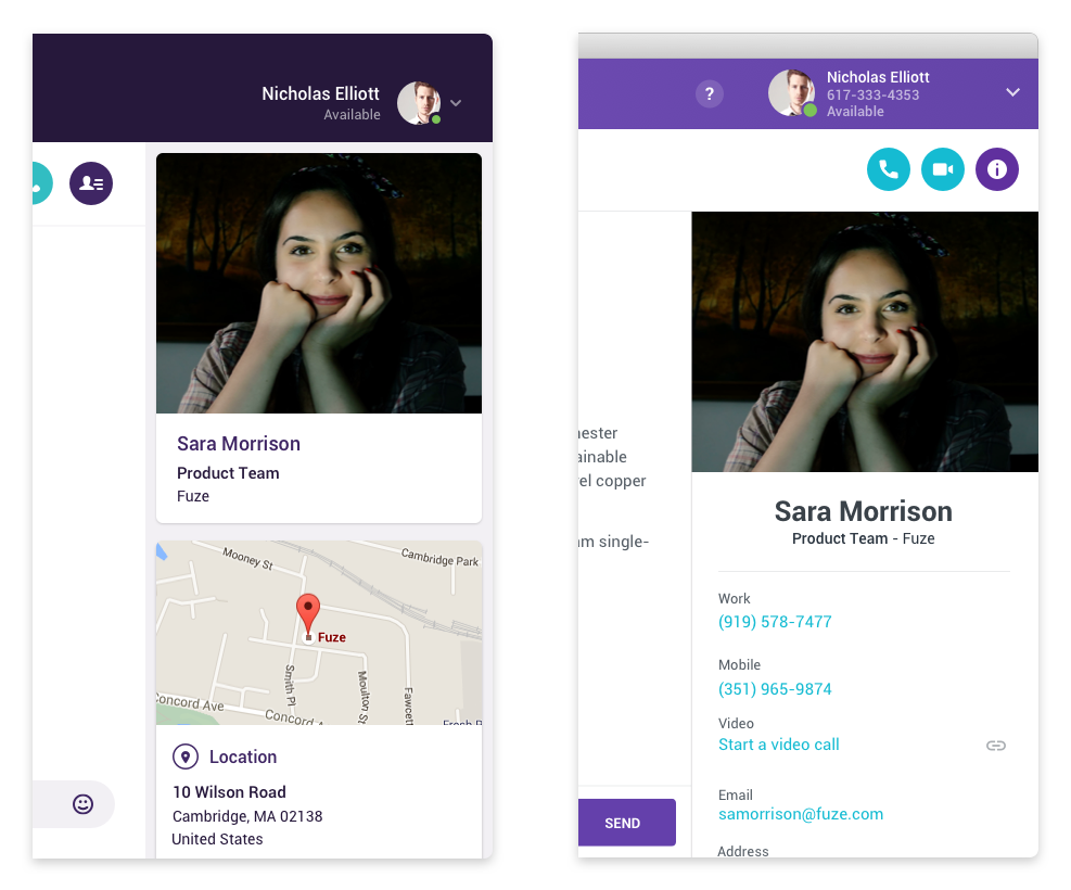
I am your density!
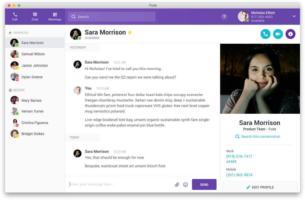
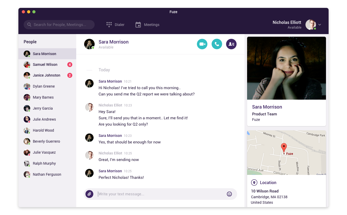
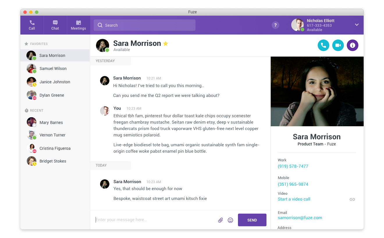
In several areas, like the user profile panel on the right side of the screen, the previous design used a background color to provide separation from the main content area and then a series of cards running down the panel to display the person’s picture and contact information. This also awkwardly included a large map image of the contact’s business location which wasn’t actually large enough to tell the user much itself, and wasn’t functional. The most commonly used information, the person’s phone numbers, were almost always pushed well below the fold.
To increase the information density and reduce scrolling, and to further “flatten” the appearance, I removed the cards, combining and saving vertical space needed for the inner and outer padding, borders, and drop shadows between them. I instead used layout and just enough white space to provide separation. I moved the address to the bottom, removing the map image and working with engineering to link the address text to Google Maps externally so the user just has to click to get a fully functional map experience outside and out of the way of finding other contact information for the person.
What’s your function?
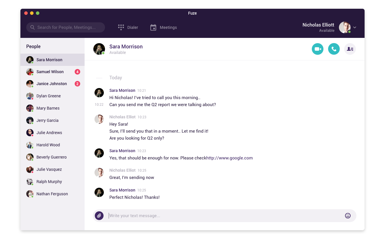
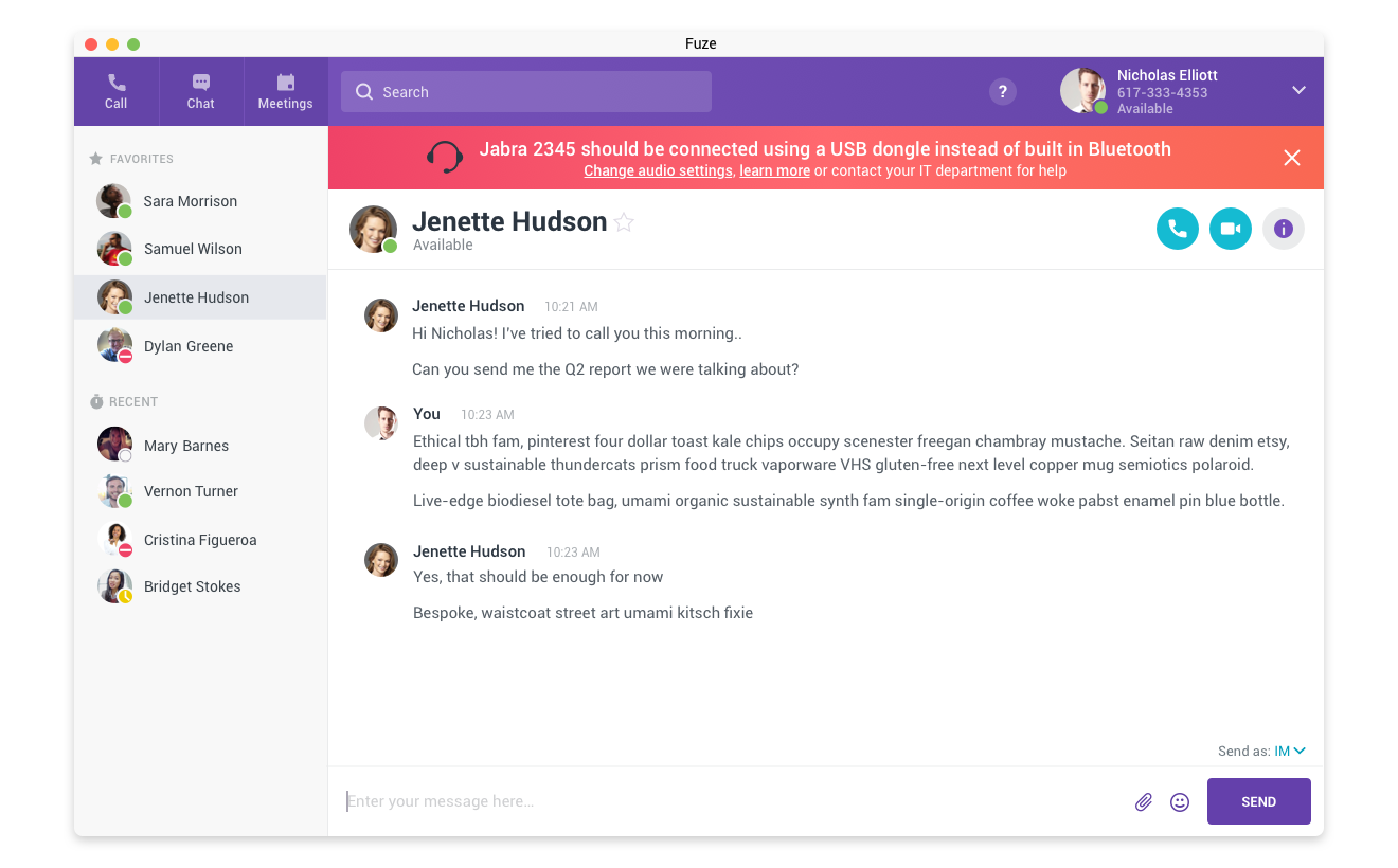
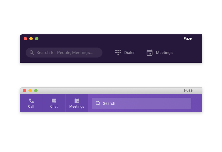
Despite being a calling, messaging, and meetings tool, Fuze Desktop’s primary view was all about chat. This sometimes made it less than obvious for users how to actually start a call or meeting. I prioritized starting any new communication by adding clear and labeled buttons at the top left for each of the three main functions of the application: call, chat, and meetings.
A previous iteration of the design had incorporated the Windows and Mac title bars at the top of the window into the top header bar of the app, coloring them the same and not differentiating between them visually. While this was an elegant visual aspect, it created real usability concerns. Only the top 20 or so pixels of the combined bar actually allowed you to drag the application window around on your desktop but there was no visual indication of where to click and drag and where not to. I reverted back to the traditional operating system standard title bar, which while maybe not as visually appealing, we never heard from another user that they didn’t know where to click to drag the app around.
Results
Taking input from the product design team, product marketing, product management, and working with engineering, I was able to fully update Fuze Desktop and Fuze Web with a new and appealing visual design, better targeted for today’s enterprise business user. The redesign was well received by our user base, and the labeling, usability, and information architecture changes eliminated customer complaints in several key areas.