Fuze responsive design
My role: user experience, user interface, information architecture, responsive design, visual design
Fuze provides enterprise businesses with unified calling, meetings, messaging, and contact center services.
The Challenge
Thousands of enterprise business workers rely on Fuze Desktop and Fuze Web to communicate with their customers, prospects, and colleagues every day. They also rely on many other business productivity applications from word processors, spreadsheets, and presentation software to CRMs or other specialized tools to perform their jobs. Based on feedback that our applications were taking up too much of our user’s screens, I was tasked with figuring out how to get Fuze out of our users way while still allowing them to easily use all of our functionality.
Space! How low can you go?
Offering robust functionality in a compact form factor was not a unique challenge to Fuze. Many web sites and applications were already applying Responsive Web Design to allow users to use the tools they need at the size they want. Fuze is also built with standard web technologies so this concept seemed like a good candidate.
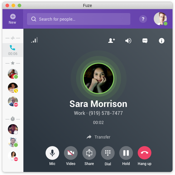
Nearly all of the requests we received to make Fuze smaller were in reference to messaging or calling. At the time, Fuze’s minimum window size was considerably larger than most of our competitors in the chat space. Calling, by its nature, is an audible experience. Outside of being able to see information about who you're talking to and accessing controls for the call, it shouldn’t need to take up any space. Conversely, when users join a meeting, it's much more common that users maximize the window to enable as immersive an experience as possible. This suggests that people use the application at different sizes and resize it throughout the day. Because of this, I didn't want to make a lot of unnecessary and potentially disorienting UI transformations to allow for flexibility.
Content first, but don't lose context!
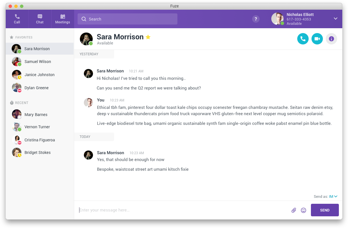
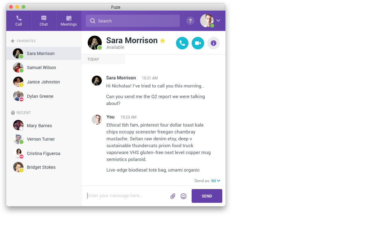
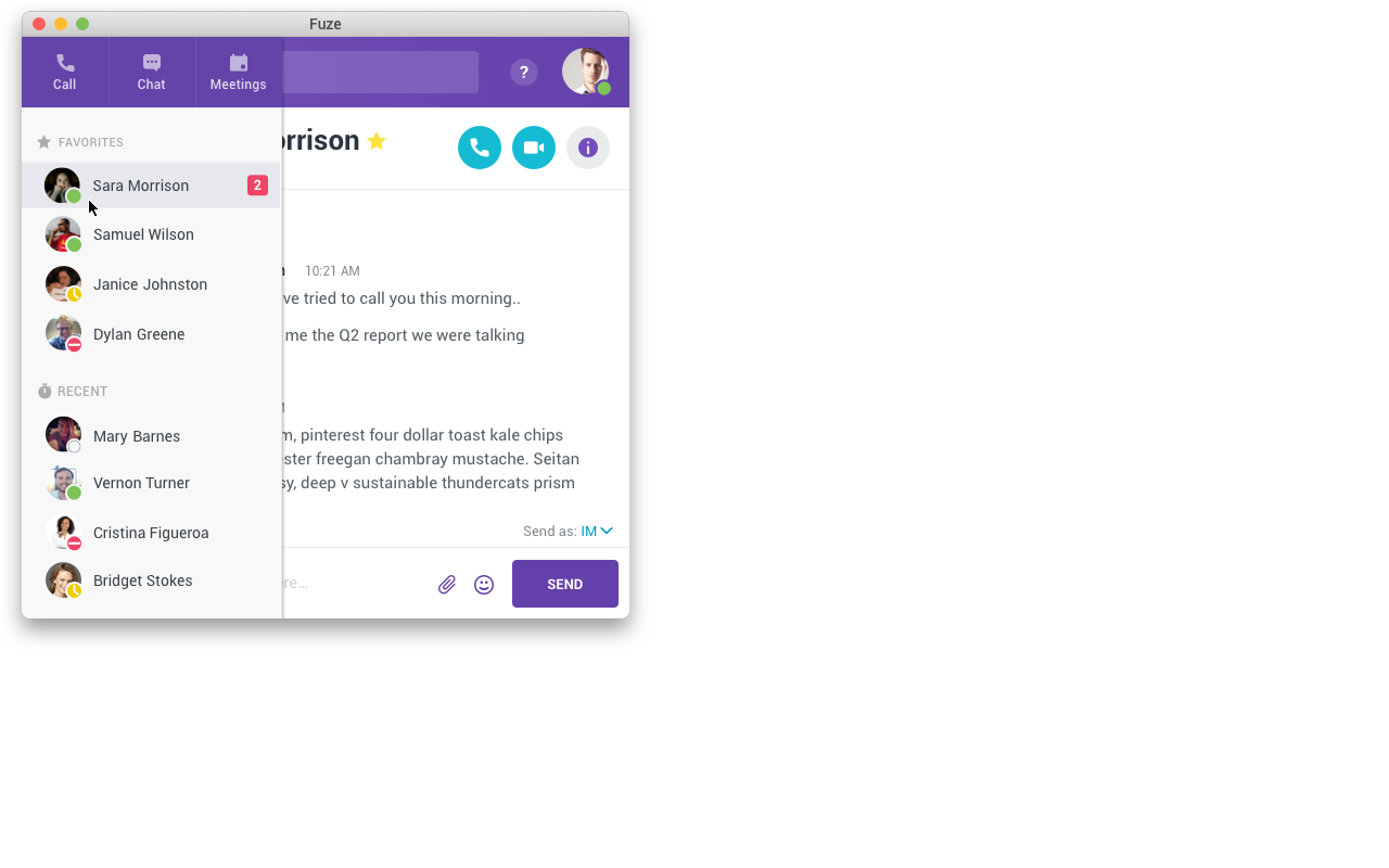
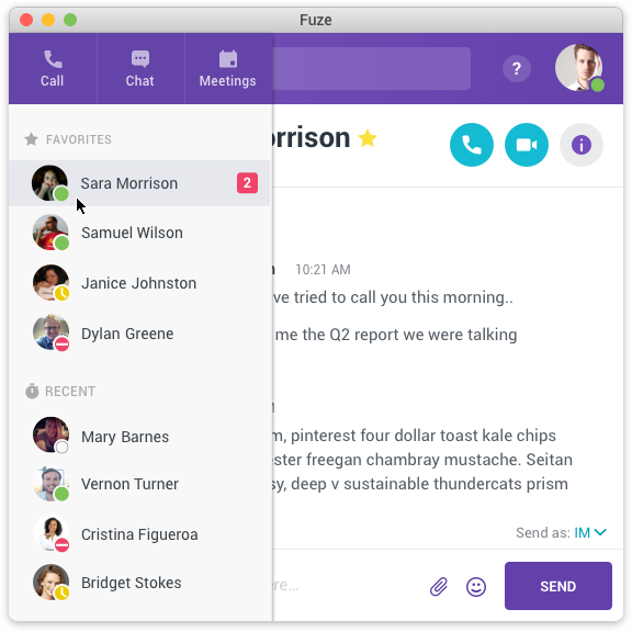
I started by prioritizing content over navigation. In a communication application, the messages, calls, and meetings the user is participating in are the primary content so I wanted to allow them to use as much of the window as possible. Notifications of new communications can be just as, or even more important than whatever the user is currently looking at. Multitasking is common and critical with users needing to maintain real time communications with multiple contacts throughout their day. Notifications primarily display in the Fuze left sidebar. It’s a critical component, but also takes up a lot of space.
Competitive research showed that similar applications typically followed one of two patterns. The first was to allow you to manually minimize the sidebar, but then require you to manually expand it again. The second was to collapse the sidebar automatically when the window got too small for it to fit, but then require you to stretch the window back out to a larger size to see the whole thing.
Neither of these were ideal from the user's perspective. Both offered a binary choice between getting the sidebar out of the way and being able to see the full information it provides. What users actually wanted was an obvious notification of anything new AND quick, easy access to more information on demand.
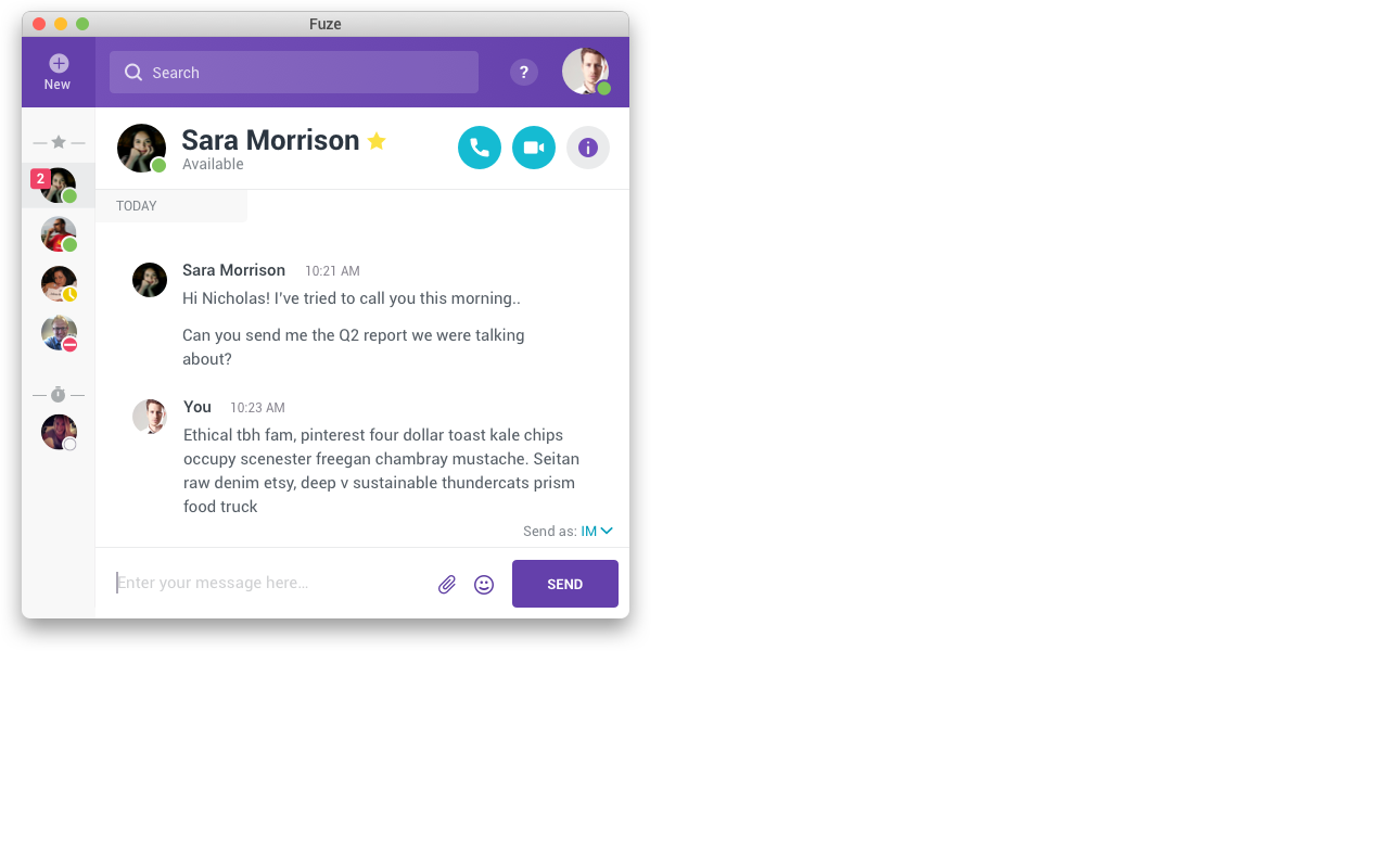
To accomplish this I made the sidebar collapse automatically when the window got too small to comfortably show both columns, but expand back out instantly, when you hover over any part of it, floating over the main content area. To get it out of the way again you simply move the mouse off of it and it shrinks back out of the way.
Other challenges
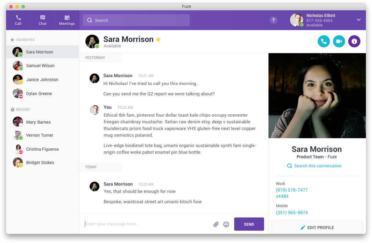
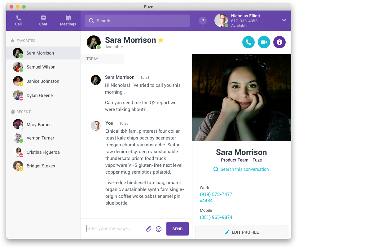
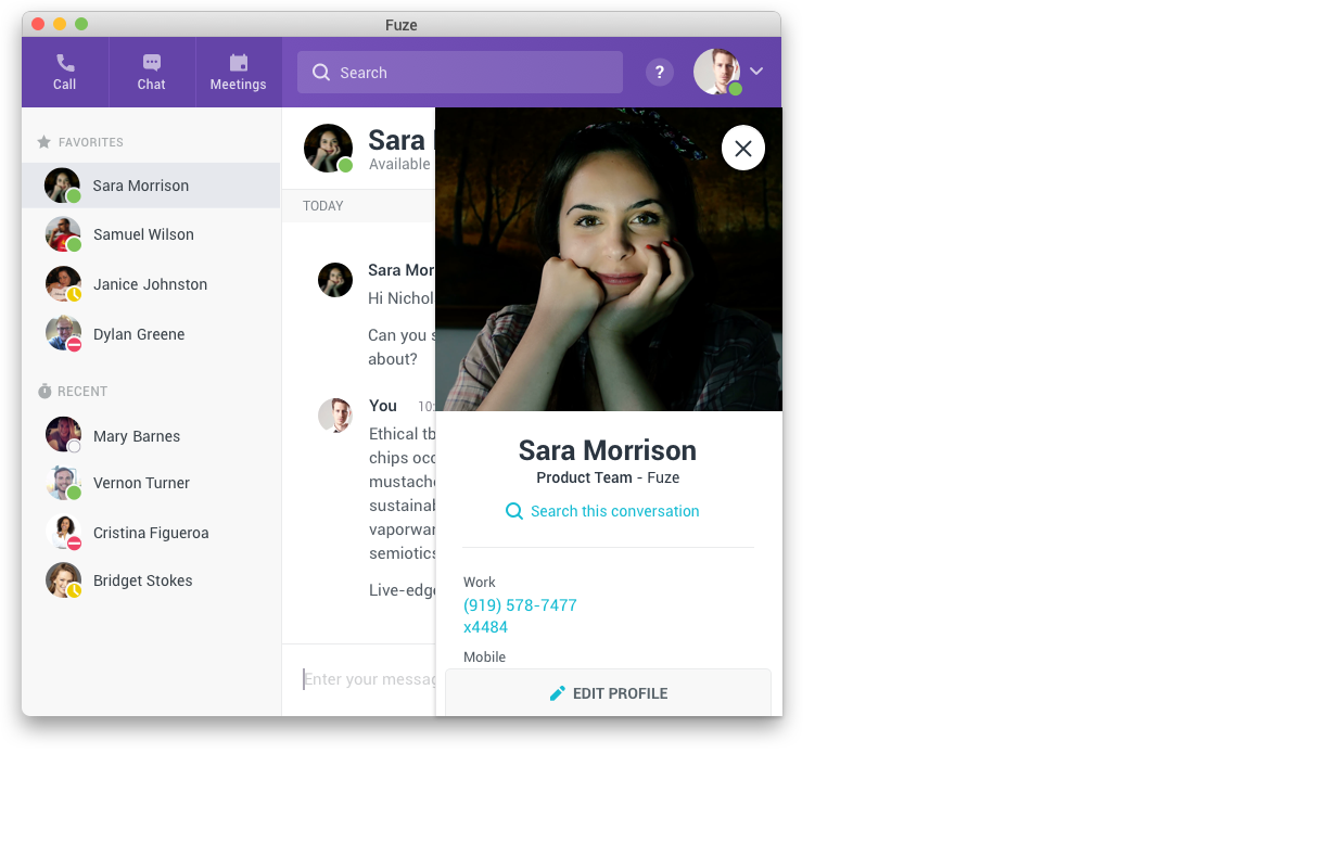
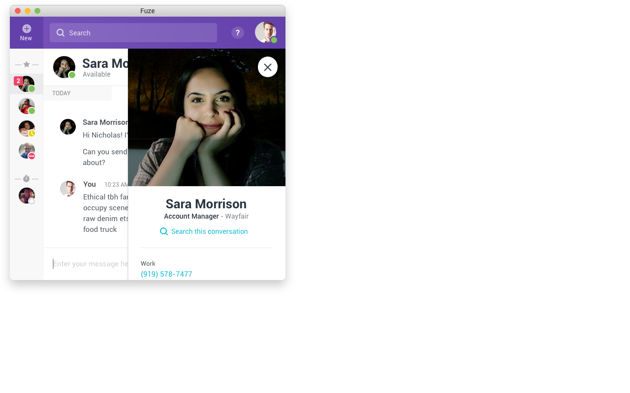
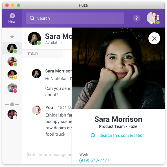
Fuze has an expandable panel on the right side of the window that can be opened to show a profile of the person or group you are communicating with. At larger window sizes, this panel pushes the main content over and shares space with it. When we made the window smaller, it made both the main and this secondary content difficult to read or use so I floated it as a separate layer on top of the main content when it was open instead of dividing the space. Again, available on demand, but out of the way when not needed.
There were several other navigation components and areas where the navigation we were using was very wide and inflexible. I redesigned these to fit at our new smallest size first and grow as space was available if the window was made larger.
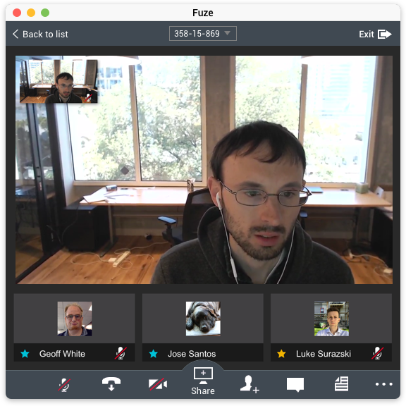
Finally, where fully redesigning the meeting interface was outside the scope of this project, and it was already relatively flexible, I was able to address the main header info bar and footer control area to make sure they fit and were usable down to our new smallest window size.
Results
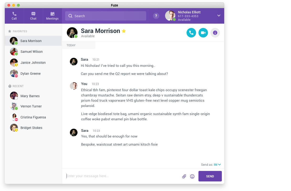
I reduced Fuze Desktop’s minimum width by about half from over 900 pixels down to 560 pixels, and reduced its height by about a third. In the process I was also able to fix several pinch points where various columns and panels had previously competed and caused a less than ideal experience. This dramatically reduced the number of complaints from users about taking up too much of their screens and addressed other usability issues, but mostly allowed Fuze to fit better into the daily work routines of our users.