Carbonite restore flow
My role: user experience, user interface, information architecture, visual design
Carbonite's flagship computer backup product is trusted to protect data on over 1.5 million computers for consumer and small businesses.
The Challenge
Backing up data is only useful if you can get it back when you need it, and when you need it, you want it back as quickly and easily as possible. Our data showed that only one in ten customers who back up their data ever need to restore it. However, topics around restore were constantly the most searched in our knowledge base and an overwhelming share of the support calls we received were from users trying to figure out how to get their files back. We also consistently saw low satisfaction ratings from users who did restore.
My Process
Working closely with a liaison from our support team and tracked usage data, we were able to identify problematic aspects of our existing restore flow where we were causing doubt and confusion instead of instilling confidence in our users.
To validate our assumptions and discoveries, I created a clickable prototype of our existing flow using InVision and worked with our research team to run moderated tests on it to see firsthand what made sense and what confused our users or caused them to give up completely and call support.
Once we identified the issues with the existing design and flow, I created a new simplified flow, updated the screens, and iterated through several rounds of testing and revision until users could complete it and understood what was happening at each step.
Key Findings
-
Users generally had two main use cases for restoring files:
They had accidentally erased, overwritten, or saved unwanted changes to one or a few specific files.
They had a hard drive or computer fail or were upgrading to a new machine and wanted to put all of their files back where they had been on their old computer or drive.
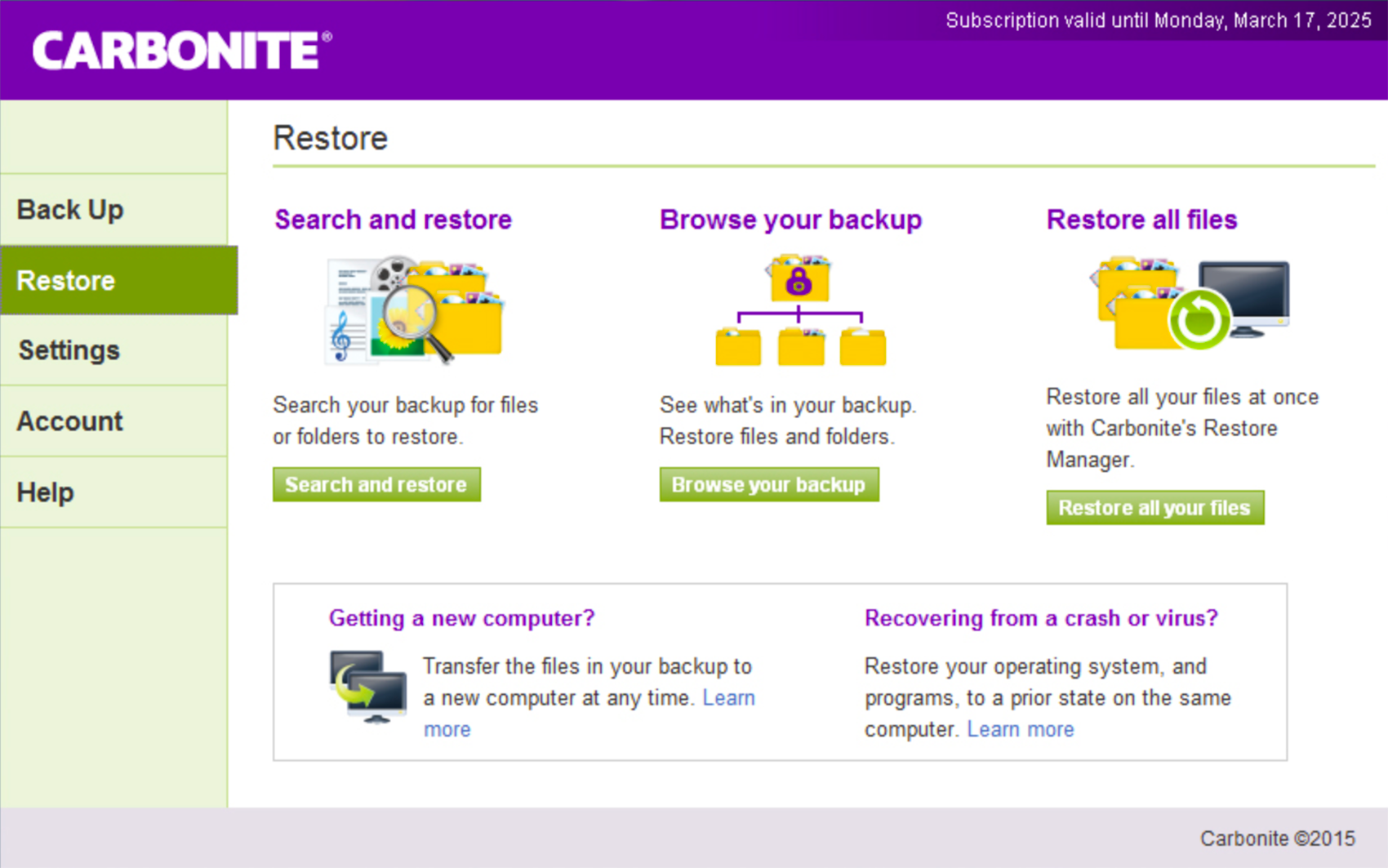
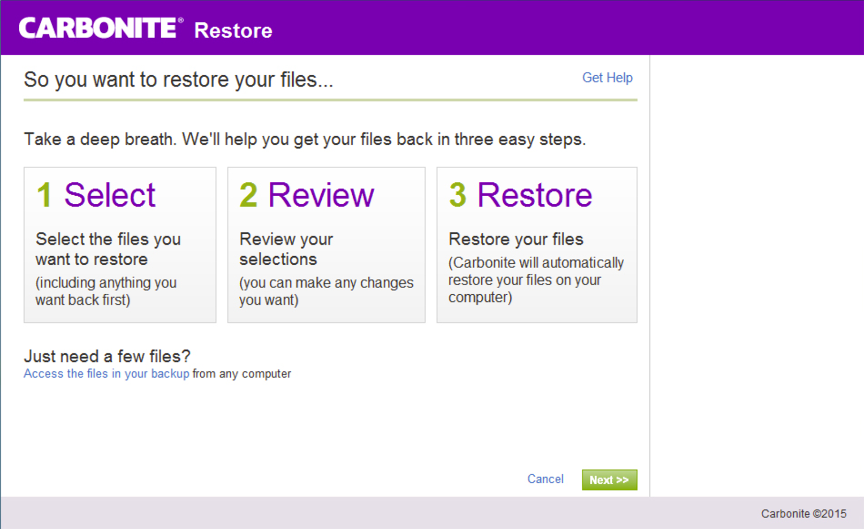
The existing restore screen presented the user an array of 5 different options for getting files back, each with a complicated multicolor illustration made out of multiple icons and all presented with largely the same weight and priority. Users found this confusing and had trouble finding the option they needed.
There were two separate screens and processes for browsing and searching a user's backup for specific files. Users expected these to be possible in one place.
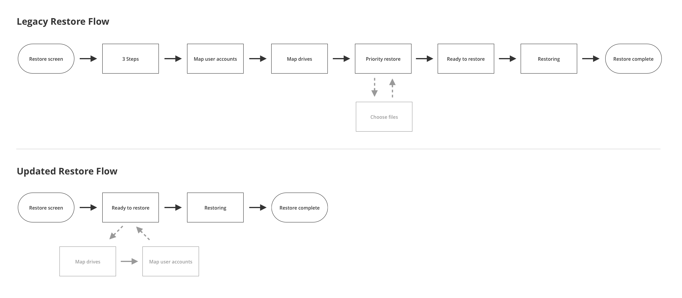
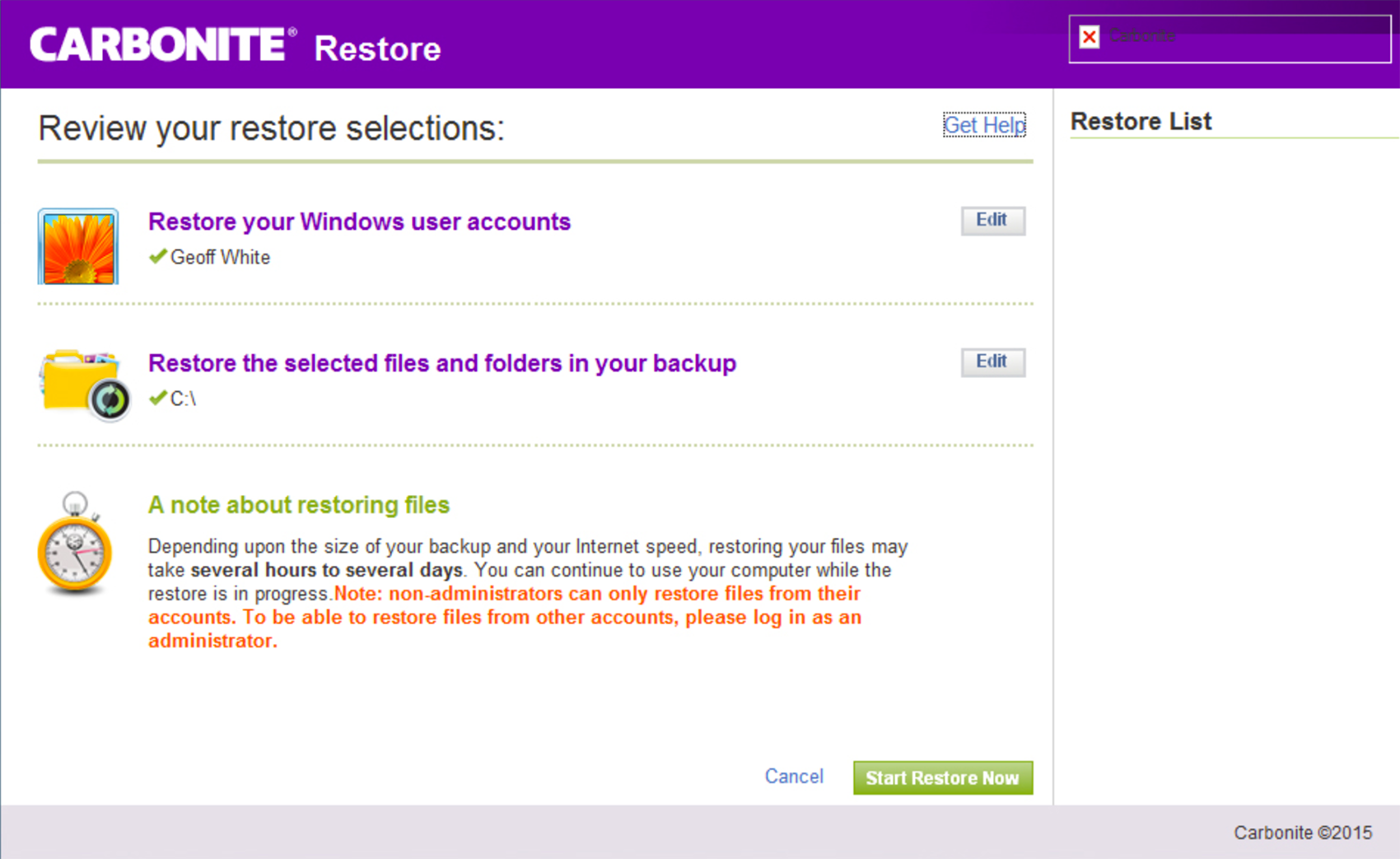
The flow for restoring all of a users files was built to accommodate several important but largely uncommon edge cases. The average user had a computer with a single hard drive and typically two user accounts (one admin and another that was their own personal account), but the restore flow was walking every user through screens for mapping hard drives and user accounts.
There were several other UI issues that added confusion and complexity to the overall restore experience.
Some users told us right up front that regardless of how simple our restore was, they would call support first and have them walk them through the process of getting their files back. Users who lose critical files or a whole drive or computer full of them are typically somewhat panicked and desperate to know that all of their data is safe and they can get it back as fast as possible.
Solutions
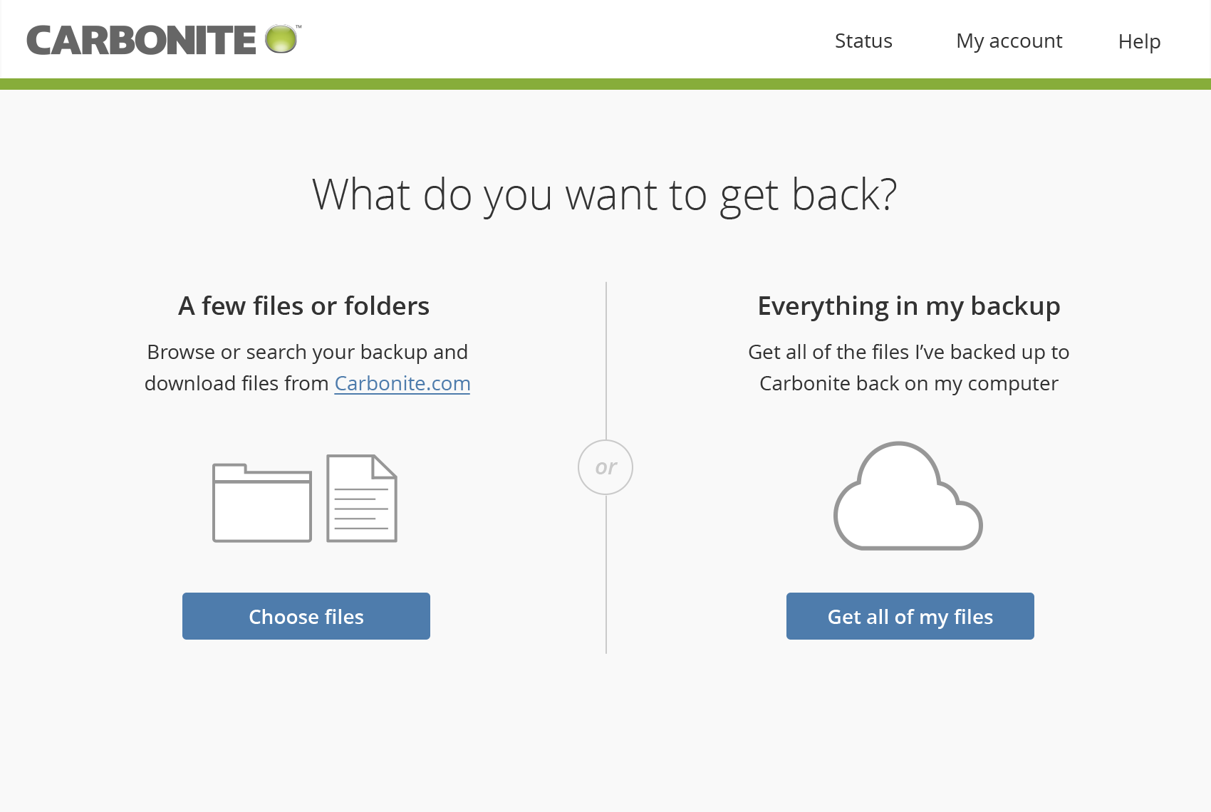
I aligned the main actions we offer on the initial restore screen with the primary use cases we discovered, using the wording for each of them that our users used to describe them to us. We also removed or offloaded the less common options to other areas.
I redesigned the online tool for finding and restoring specific files, combining the browse and search functions as users expected.
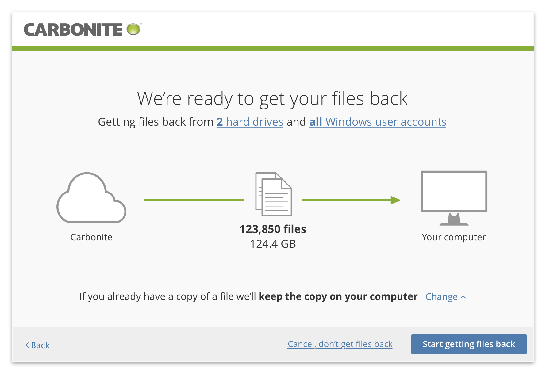
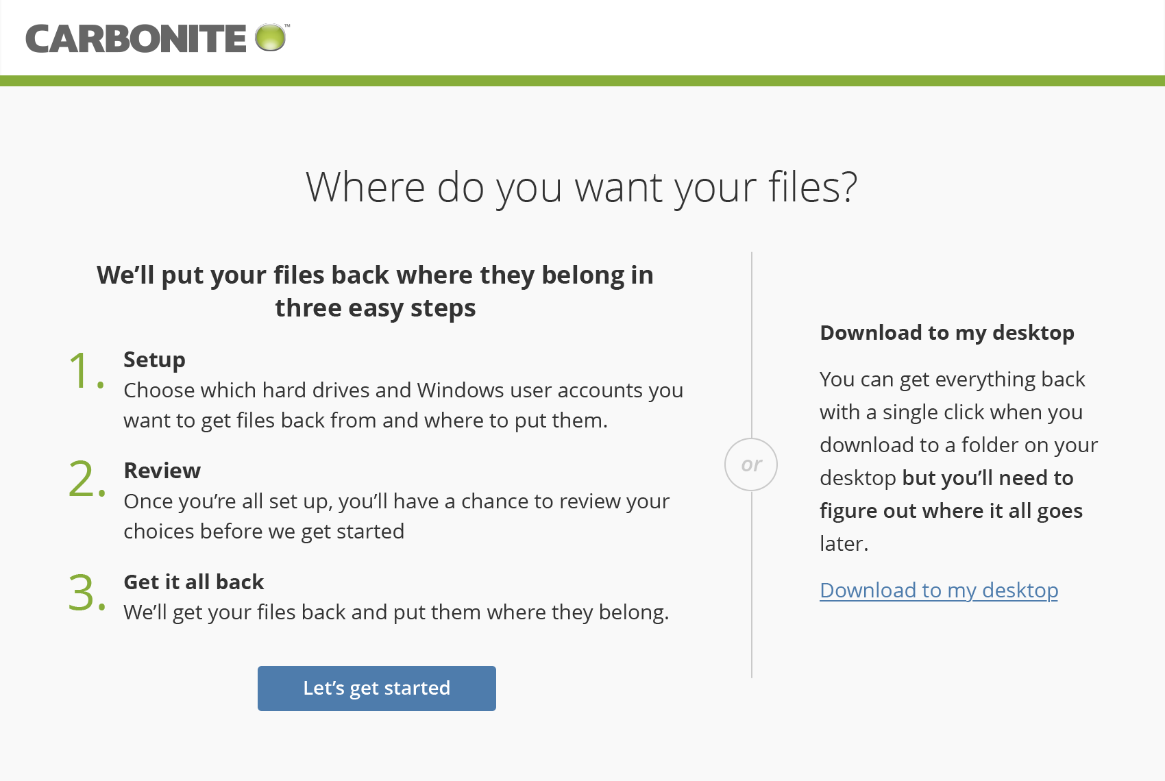
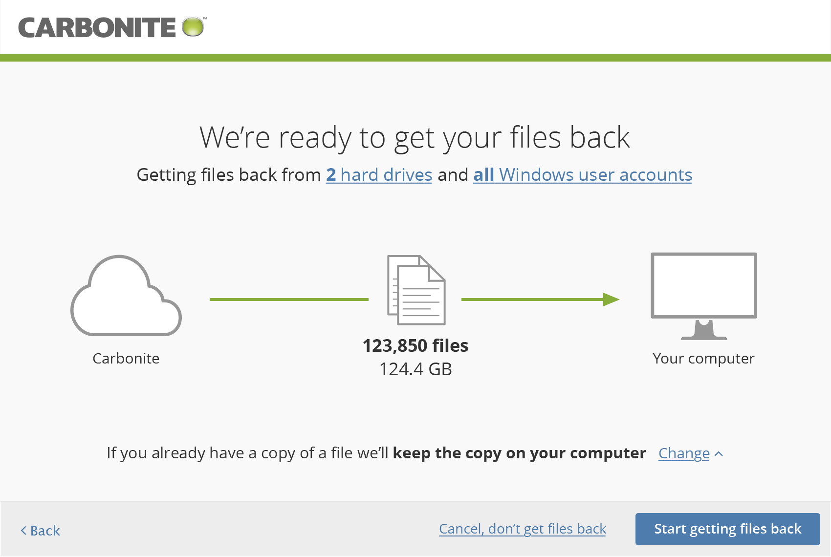
When restoring an entire backup, I defaulted to a simple mode that would automatically "put everything back where it came from." We added logic to compare the user's backup with the computer they were restoring to, and if they had the same number and type of user accounts and the same number of drives, we skipped those steps completely but allowed users to go back and change those options before restoring if they wanted to. We were able to reduce the number of screens a user had to click through to perform a typical full restore from 8 to 2.
I completely overhauled the visual design of the entire restore interface to match the simple, clean, look and feel I had previously applied to the rest of the product.
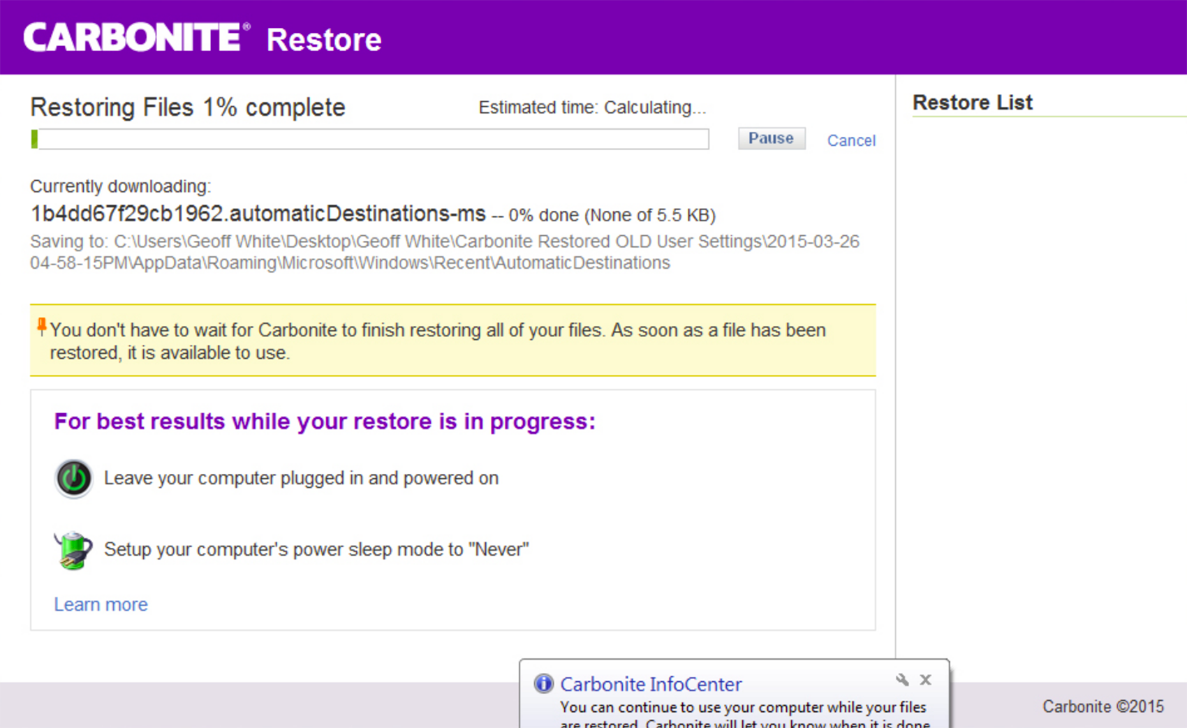
Legacy product
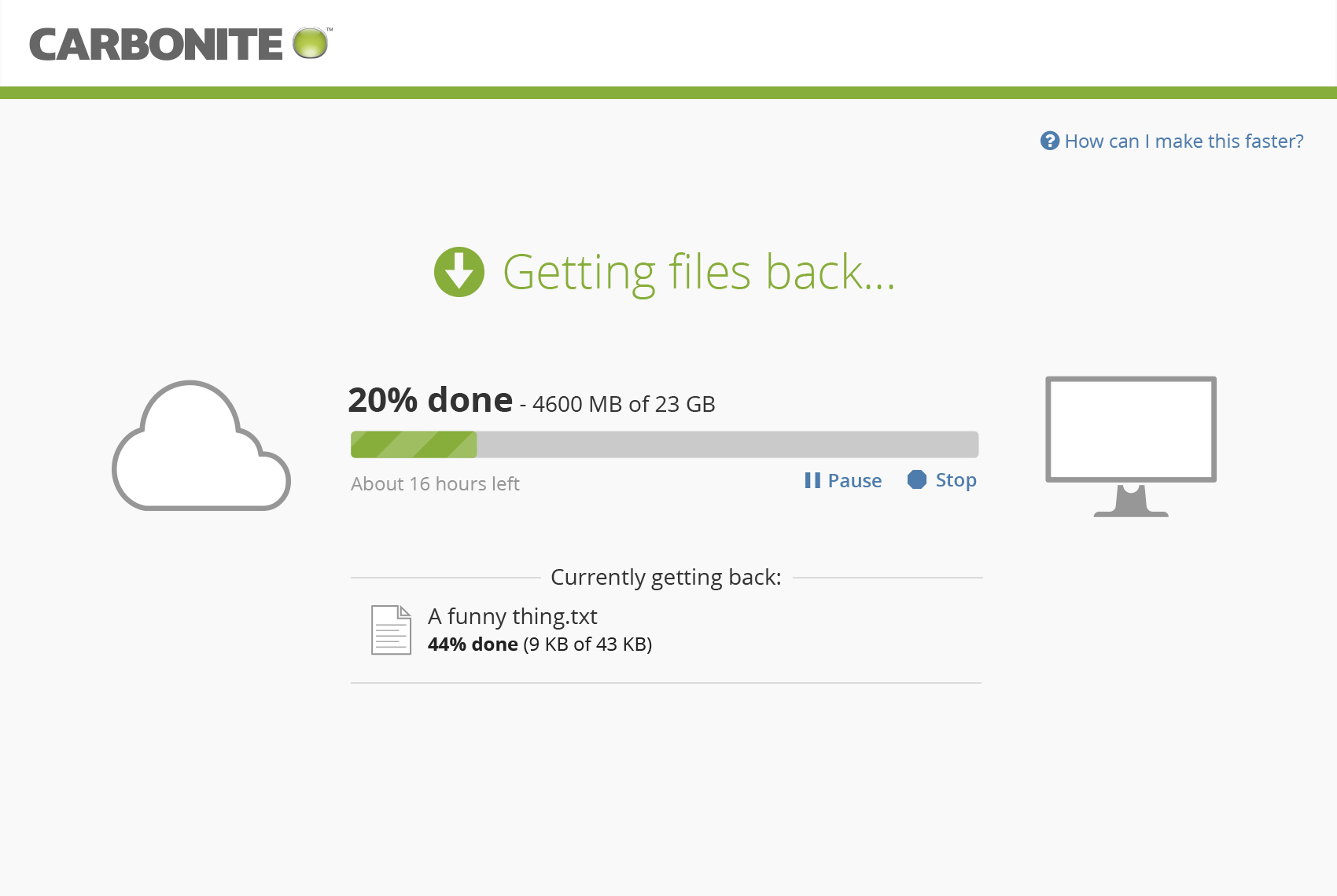
Updated design
Legacy product
Updated design
Legacy product
Updated design
Legacy product
Updated design
Results
Making these changes did help to reduce support call volume, but for the users who would call support no matter what, we were also able to reduce call complexity and length, saving critical support dollars. Making these changes also improved our overall customer satisfaction, especially for users who had restored.