Jenzabar Mobile
My role: user experience, user interface, html/css/jquery mobile prototyping
Jenzabar provides higher education institutions around the world with products and services including enterprise resource planning (ERP), student information systems (SIS), eLearning, analytics, and student retention.
The Challenge
Jenzabar Internet Campus Solution (JICS) provides colleges and universities with a portal and intranet where students, faculty, and staff can perform nearly every function and interaction needed during campus life. From application to course registration, housing arrangements, performing or delivering and grading coursework, student success intervention, through to graduation. Many of Jenzabar’s customers also use JICS to power their public facing web sites.
As smartphones rapidly became the primary way that students and faculty experience the internet and their online existence, it became obvious that JICS needed to be able to deliver all of this functionality through this medium.
Originally designed and built long before the rise of smartphones, JICS was optimized for large screens and keyboard and mouse interaction. It was also built to be almost infinitely customizable, a portal framework with modules or “portlets” that customers could deploy wherever they wanted with whatever site architecture and information architecture they desired.

The Journey
This whole project was basically the opposite of mobile first design. Responsive web design was a relatively new concept, and there were some pretty serious technical hurdles to applying it to the existing computer focused web product. Mobile apps were also much more widely used than mobile web sites at the time. Rather than adapting the entire existing portal and all of the modules to play nice on a tiny screen with touch gestures, we decided to use a mobile framework to create a new mobile optimized companion product.
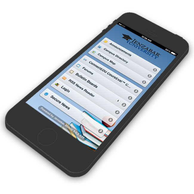
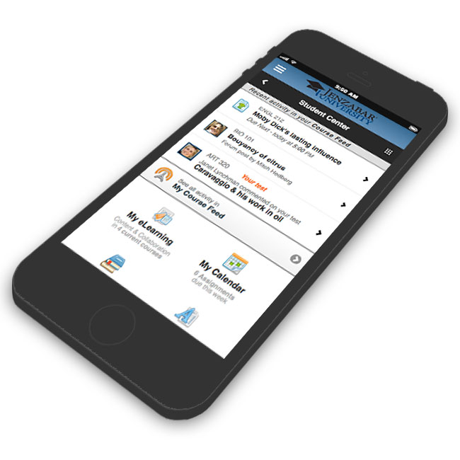
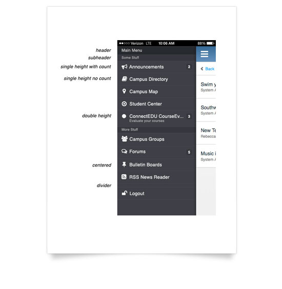
We created a customizable menu system to allow our institutions to deliver the same content and tools in a similar fashion to their desktop sites, but were always looking for ways to keep the hierarchy as “flat” as possible and require the fewest taps to get to each item. From there we prioritized all of the modules by usage and critical function on campus and created a mobile optimized interface for each of them. We saw that our customers typically created defined areas of their intranets for students and faculty containing all of the relevant modules for each of those personas. Instead of forcing them to recreate those groupings manually, we introduced the "Student Center" and "Faculty Center", offering a simple way to add the whole collection of tools for each, ordering the portlets within them according to the most common usage. If they had specific needs, they could add the whole "center" and then customize within it, but for many schools, just adding it gave them exactly what they needed.
Shifting context requires a new approach
We were under a lot of pressure to get all of our modules available on mobile as fast as possible. The easy way to accomplish this would have been to try to translate every portlet as-is while just replacing mouse controls with touch ones. I knew this wasn’t going to provide a great experience though and would likely lead to a lot of customer ire and rework down the road. Every time we started a new module we asked ourselves (and our customers) “How do the use cases change for this when using a mobile device?”
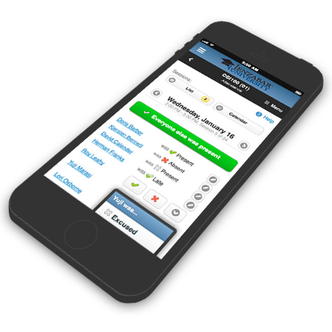
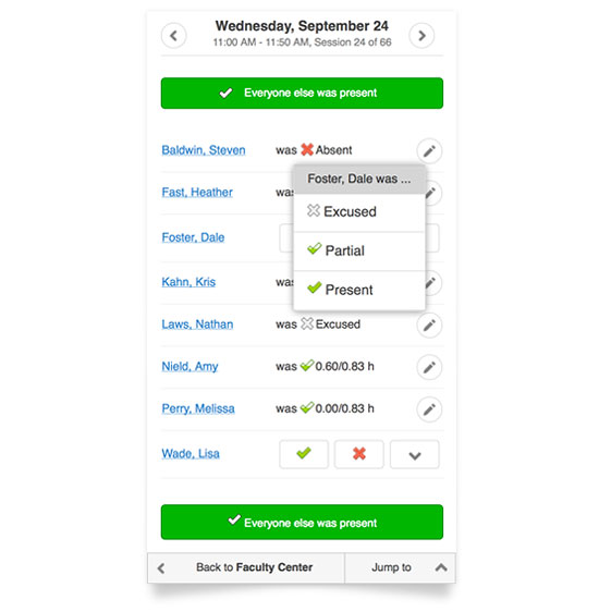
One notable example was our attendance feature. In the desktop context, most instructors either had a physical paper sign-in sheet at the door, or would jot down each student's status while class was in session. They then entered it all into the computer at once, diligently clicking dropdowns and selecting options for each student.
I quickly realized that that's not a very likely use case with a mobile system. If an instructor can enter attendance on a mobile phone or tablet, it's far more likely they will enter it directly in the first place, saving themselves the extra step.
So how do we support that? Is it a large class or early in the semester where they might not immediately be able to put names and faces together, or is it a small class where they know at a glance who's present and who's absent? I designed a solution for each of those cases. For the former, you can tap a student to view a profile page with their picture, other identifying information, and attendance for other sessions, mark their attendance and then advance to the next. The instructor can move through the entire class alphabetically, see who they are dealing with and mark each student accordingly. For the latter, I provided a simple list view with simple buttons for Present and Absent while leaving less frequently used options like Partial and Excused in a dropdown. Also, to reduce the number of taps necessary for the most common option, I added bulk action buttons to mark everyone in the class as present so an instructor then only needs to mark those who are absent, partial, or excused, and tap once to complete the attendance for the class.
Results
Jenzabar Mobile is used by tens of thousands of students and faculty around the world to accomplish a wide range of activities including registration, taking and teaching courses, grading, and social interaction on campus, from application through graduation.
A great side effect of having to distill everything down to fit on a small screen was that once I determined what was important and how to deliver it the best way on a small screen, we were able to apply several great improvements back to our desktop product.